Case Studies
The Happy Pickler
Brand Stewardship, Environmental Design & Nonprofit Marketing

PROJECT OVERVIEW
When pickle enthusiast and entrepreneur Betsy Warner approached studio Chartreuse about elevating The Happy Pickler brand, we were thrilled to help bring the next chapter of her business to life. As the company continued to grow and expand into regional grocery stores and specialty retailers, the existing branding needed to evolve while remaining true to the heart of the business and the story behind it.
The original logo, created by Betsy and her partner, featured a heart symbol representing both their love of pickling and their love for one another. Rather than abandoning this meaningful element, our team worked to modernize and strengthen the identity while preserving the personality that customers had come to know and love.
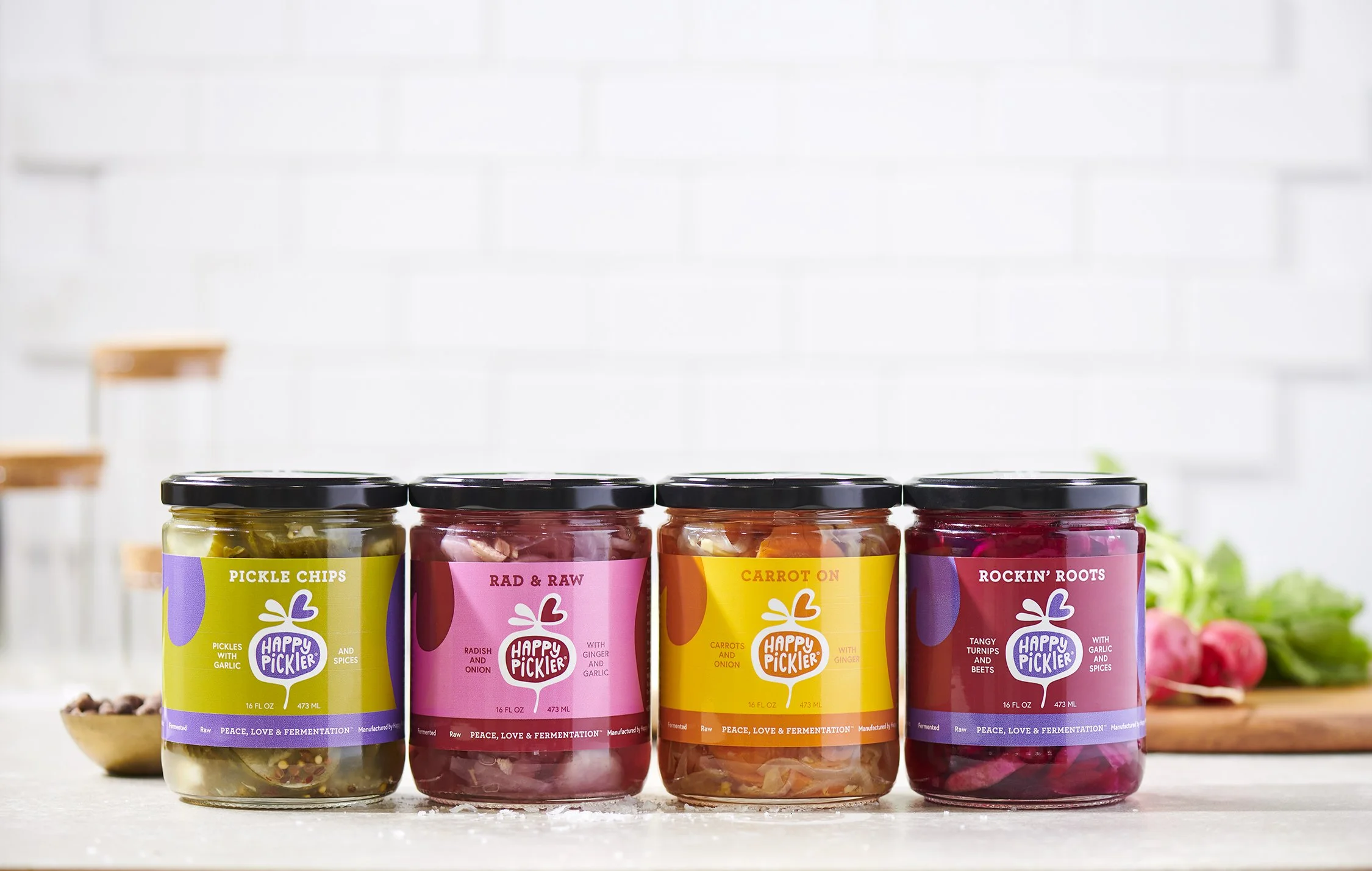
The refreshed brand retained the iconic heart while introducing a stylized vegetable-inspired graphic—reminiscent of a beet root—to represent the wide variety of vegetables featured throughout The Happy Pickler product line. This updated visual identity provided a stronger foundation for retail growth while maintaining the handcrafted, approachable spirit of the company.
Beyond the logo redesign, studio Chartreuse developed a comprehensive packaging and labeling system that could easily expand as new flavors and products were introduced. Each label was thoughtfully designed to create consistency across the brand while allowing individual varieties to stand apart on crowded grocery store shelves. The result is a cohesive product family that is both highly recognizable and retail-ready.
In addition to retail packaging, studio Chartreuse helped extend the brand into experiential and event marketing. As a longtime vendor at Northeast Ohio farmers markets, including the popular North Union Farmers Market, The Happy Pickler needed a vibrant and professional presence that would attract customers and reinforce brand recognition. Our team designed banners, table coverings, signage, promotional merchandise, and market display materials that transformed the booth into a memorable destination for shoppers.
Today, The Happy Pickler continues to grow its loyal customer base through a combination of exceptional products, strong storytelling, and a brand identity that feels as joyful and distinctive as the company itself.
Through branding, environmental design, signage, packaging, and ongoing marketing support, studio Chartreuse helped transform Gingham Market into a beloved neighborhood destination where hospitality, design, and community naturally intersect.